
UX Case Study:
Redesigning Amtrak Ticket purchasing path
Brief
Methods Used
Screener Survey
User Interviews
Affinity Mapping
Persona Development
Journey Mapping
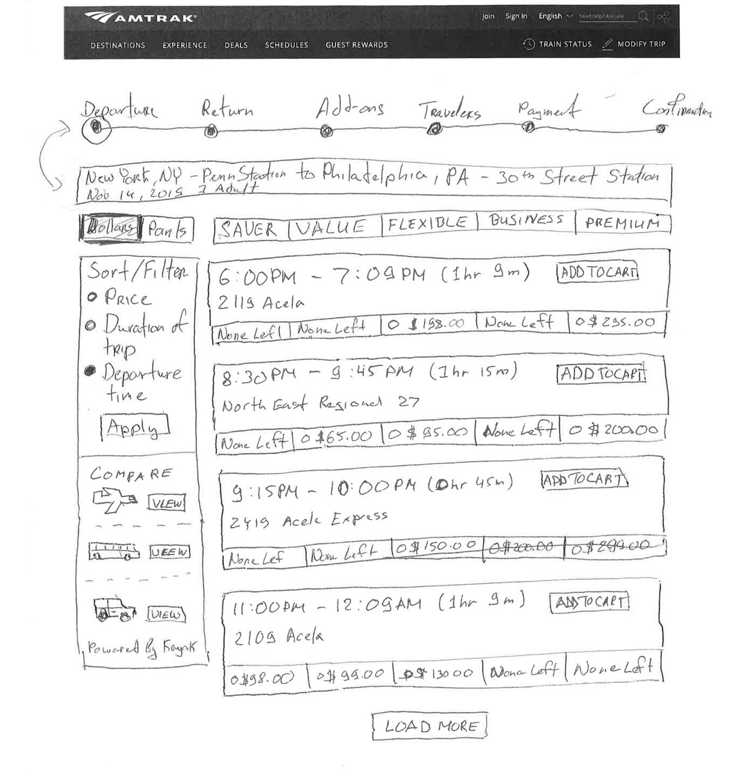
Design Studio
Sketching
Wireframes
Rapid Prototyping
Usability Testing
Team
Sergey Bestuzhev
Marilyn Shi
Richard L Lam
My Role
Research & UX Design
UI Design
Presentation Design
Tools Used
Figma
Photoshop CC
Google Slides
Google Forms
Quicktime
RESEARCH & SYNTHESIS
At the beginning of the project my team created and sent out a Screener Survey to identify users in our client’s target market (50 submissions received). We conducted exploratory User Interviews (6 conducted) with Amtrak users who have used the service at least once in the previous year to find out how was their experience with using a current version of the site.
Using Affinity Mapping technique helped us with finalizing “I” Statements that shaped the User Persona and Problem Statement that we were working towards during this portion of the project.
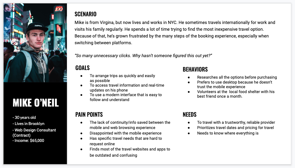
Meet Mike. Mike is the result of the trends we saw in the user data collected from interviews, so his profile is a combination of majority of users we interviewed. Creating this Persona really helped us to provide a common understanding and get a deeper understanding of the user. With Mike in head, my team came up with clear Problem Statement.
From there we have also worked on creating a Journey Map that helped to understand Mike’s paint points even better visually, going from very first step of trying to find a good deal on his phone to the final purchase made online via desktop computer.
Problem Statement
Mike and his fellow travelers compare many options before booking a trip.
People are frustrated by the online booking process.
How might we streamline the online travel booking experience?
Design
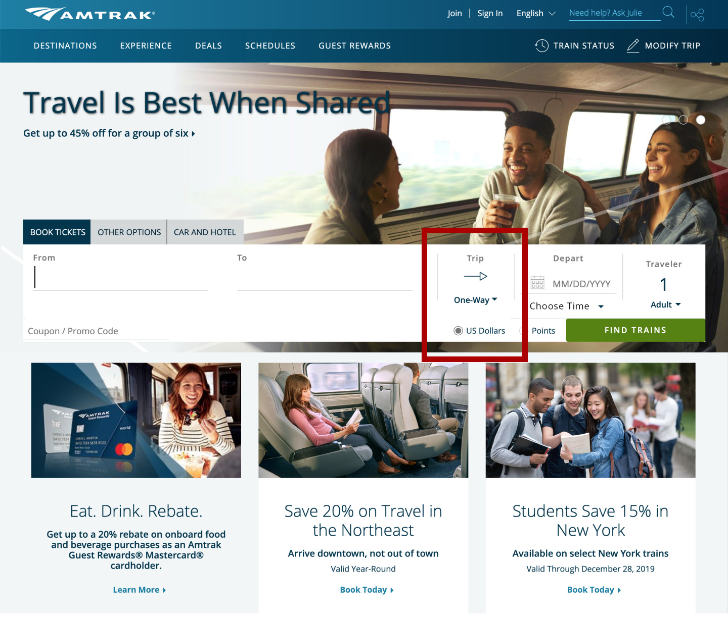
Booking Widget Redesign
We moved the Trip Type (One Way/Round Trip) to the right of the fields, because most of the users have not seen that selector, even though they had a task to select a Round Trip during our initial Usability Testing of the current site.
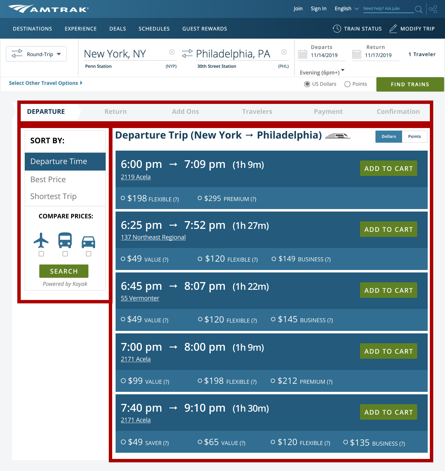
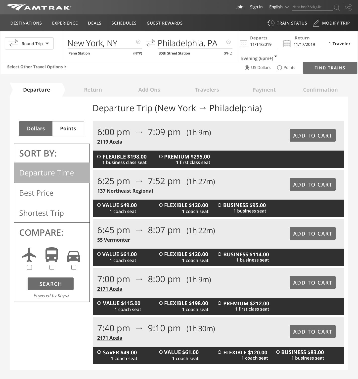
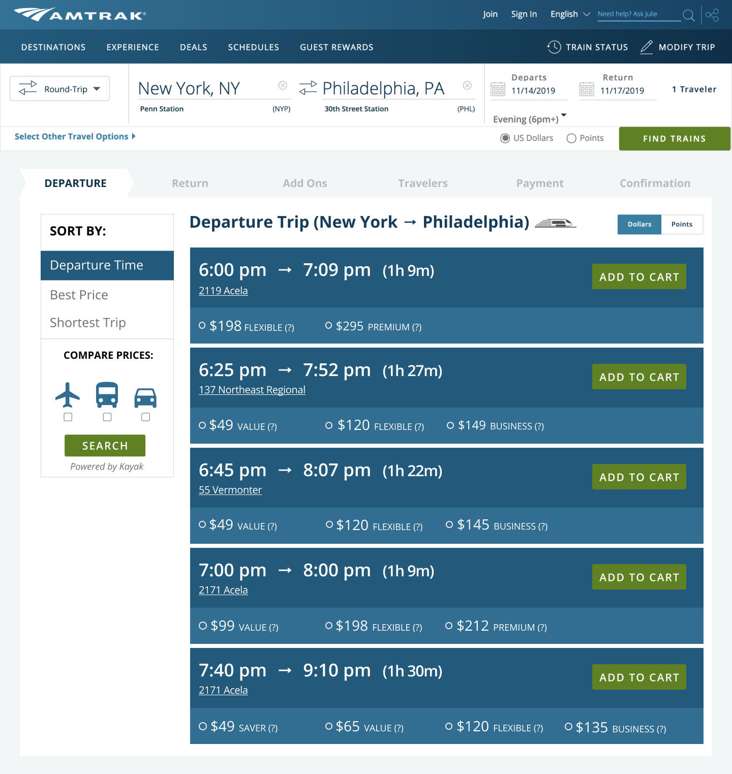
Departure and Return Redesign
Cleaned up filters, made the prices more prominent and easier to understand to users, added much simpler sorting feature, as well as Compare Prices (to other travel services) widget on the left side.
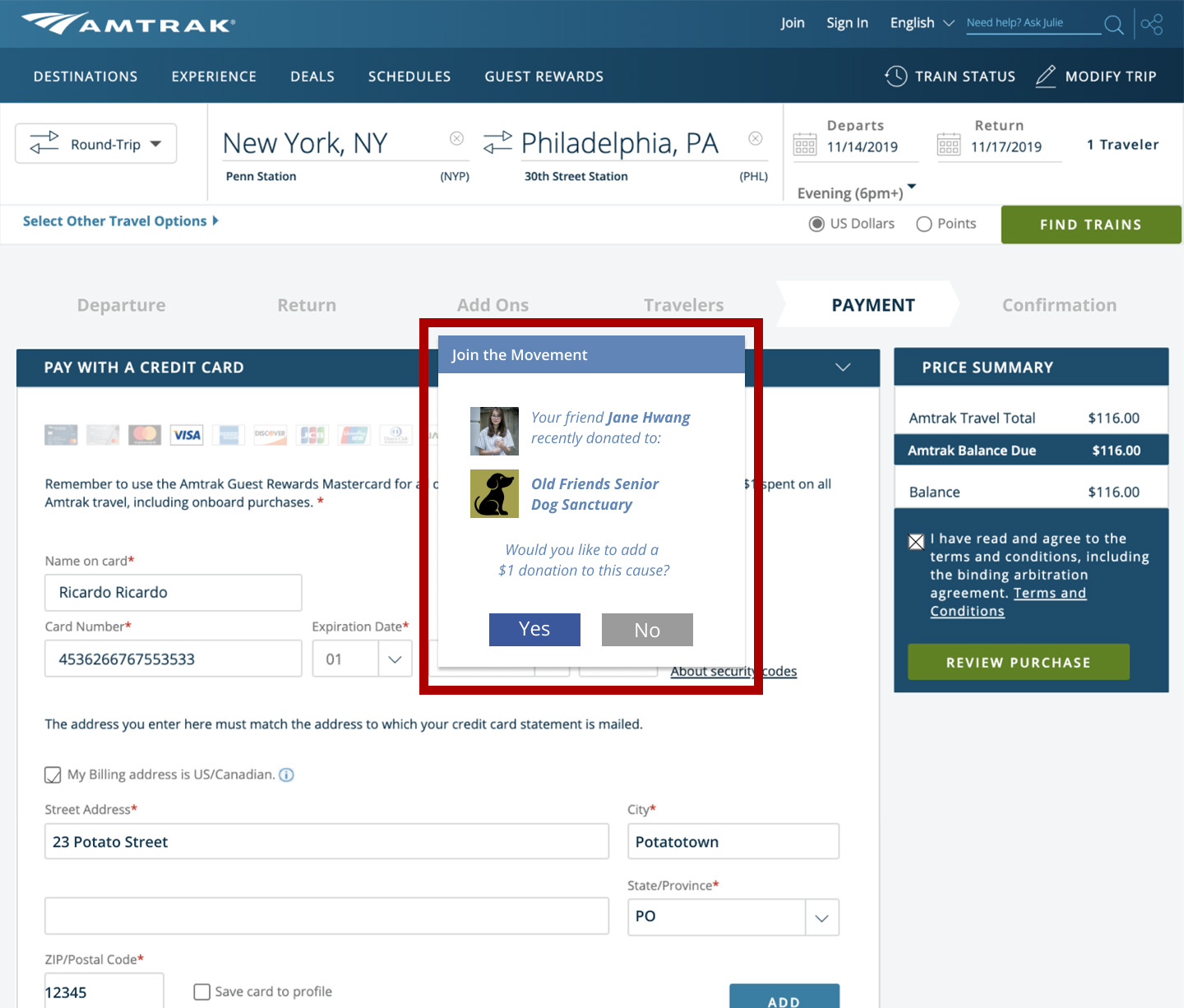
Facebook/Google Authentication Integration
When purchasing a ticket, user prompt to login to their account. If they don’t want (or not have an account on Amtrak), they can use Google login or Facebook login to have less account information to remember. This screen shows if a user have logged in via Facebook account, it will give them a popup modal window that will ask a user if he or she wants to donate to a non-profit, because one of their friends did that before.

RESULTS
4 out of 4 users on the new site — able to complete their purchase all the way through without any roadblocks.
Ease of Use and Satisfaction
Next Steps
Continue testing Sort & Compare feature discoverability
Host session to explore and refine ticketing types, price points, and naming conventions
Explore additional payment options (ie. PayPal)
Expand mobile experience
Learnings
After finishing up this project, we can definitely improve the original site and can increase the number of users buying an Amtrak ticket. There is so much more we can find and improve on the website and we just ran out of time!