UX Case Study:
Circle: Social Media app for Self-care
Brief
Wait, what? That’s it?
Well, scroll down to see what was the process that followed that sentence.
Methods Used
Group Facilitation Meeting
Screener Survey
User Interviews
Affinity Mapping
Persona Development
MoSCoW Map
Competitive Landscape Matrix
Design Studio
Sketching
Wireframes
Rapid Prototyping
Usability Testing
User Testing Reports
Team
Sergey Bestuzhev
Roma Patel
Joey (Jose) Lee
My Role
Research & UX Design
UI Design
Presentation Design
Tools Used
Figma
Photoshop CC
Google Slides
Google Forms
Quicktime
RESEARCH & SYNTHESIS
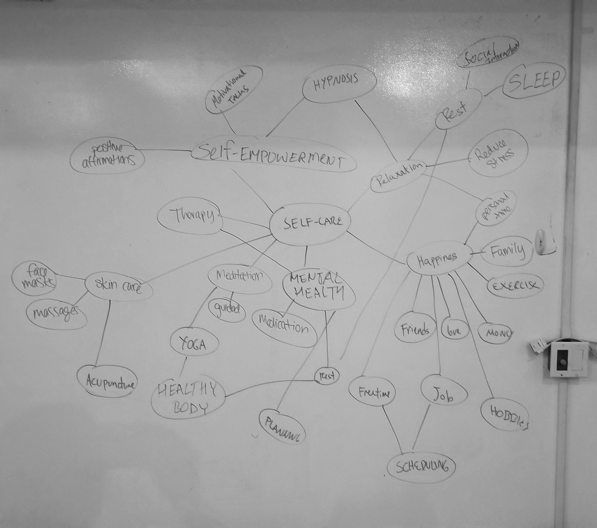
Through Group Facilitation meeting we came up with 2 specific areas we wanted to focus on: self-care and creativity
Since this was a new app built from scratch, we didn’t really initially had a user base we wanted to focus on, except for that they should be someone who takes care of themselves both mentally and physically.
To start we have worked on creating a Screener Survey to find out information we needed for this project. For this survey, 26 people submitted their answers. 21 people qualified and 5 have been selected to further interview in person or over the phone. Four people have been interviewed in person and one person over the phone.
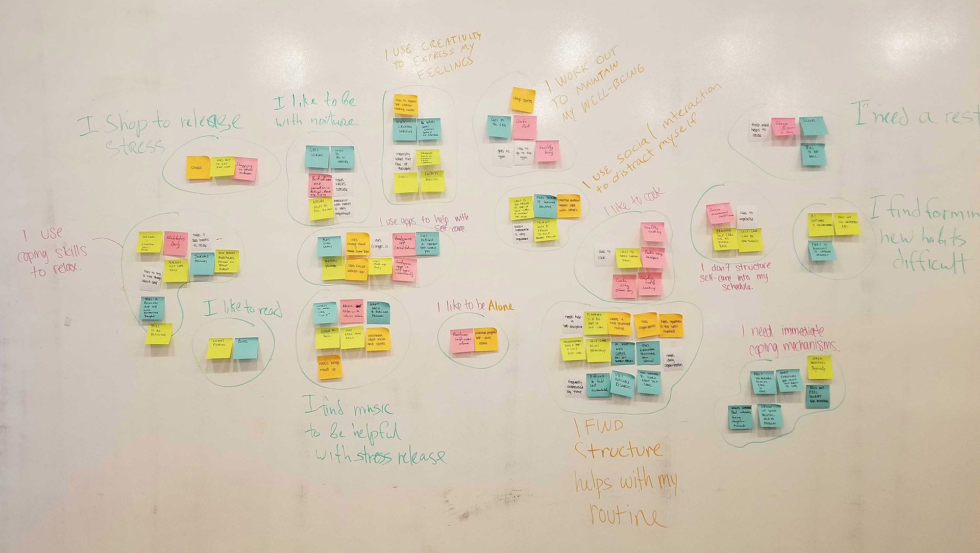
Using Affinity Mapping technique helped us with finalizing “I” Statements that shaped the User Persona and Problem Statement that we were working towards during this portion of the project.
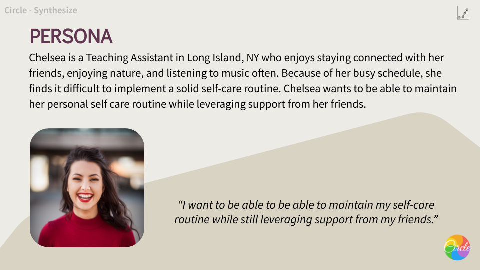
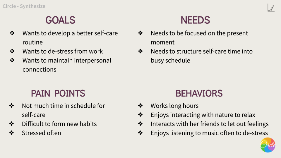
Meet Chelsea. Chelsea is the result of the trends we saw in the user data collected from interviews, so her profile is a combination of majority of users we interviewed. Creating this Persona really helped us to provide a common understanding and get a deeper understanding of the user who will be using this app. With Chelsea in mind, my team came up with clear Problem Statement.
Problem Statement
Everyday life poses numerous obligations for people leaving them with little time to organize a self-care routine for themselves and maintain it.
Chelsea has a busy schedule with conflicting obligations and finds it difficult to have time to de-stress with her friends.
How might we support her self-care routine by leveraging support from her friends?
Design
MoSCoW Map
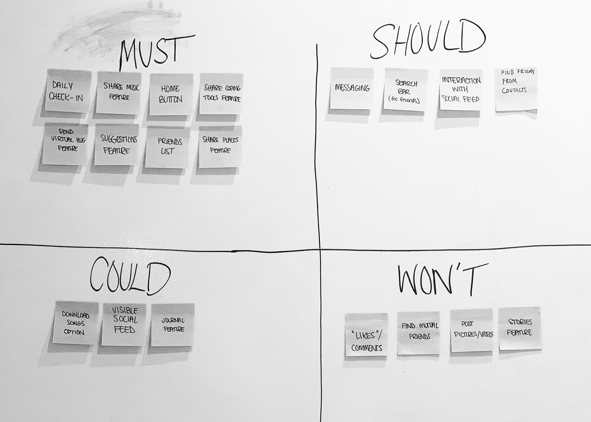
Our first step was to do a Design Studio where we all develop ideas and combine them into first draft of the app. From this we developed a MoSCoW Map that shows what our app Must, Should, Could and Won’t have on a first build.
Competitive Landscape Matrix
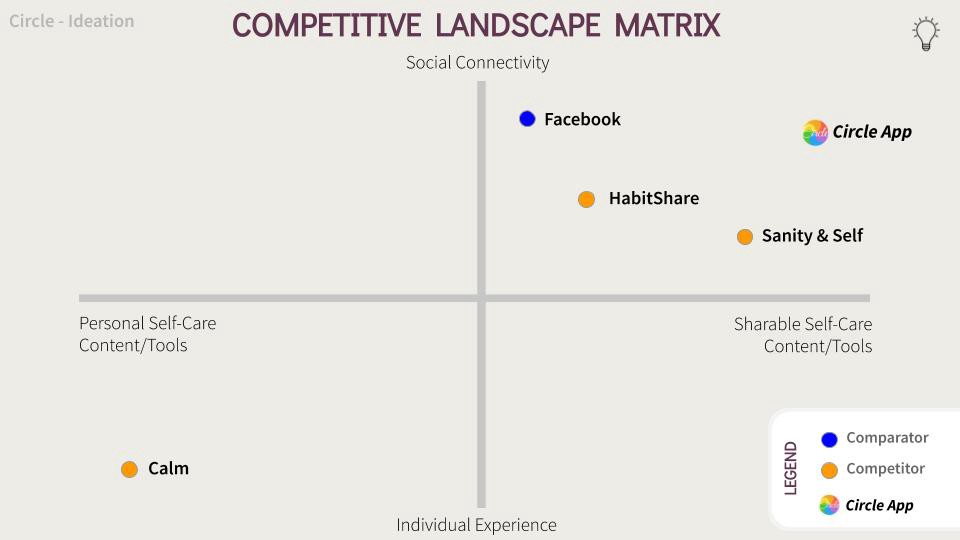
We have also worked on figuring out who are the Comparators and Competitors of the app we are trying to build. Facebook was the Comparator of course, and HabitShare, Sanity & Self and lastly Calm were the Competitors.
Platform Of Choice:
iOS. We went with the iOS platform because the majority of our users used iPhones. We chose to create our design within a native application, because most of our competitors are mobile apps. And also the user can access downloaded content without needing internet. We chose to partner with Apple because we wanted to keep all the platforms and integrations in the same place. Having an iOS platform with Apple Music and Apple Health is very convenient for the user.
What does Circle mean?
It means that this app is designed for very close friends, a Circle so to say, where no information is being shared to the public Feed.
Lo-Fi Prototypes
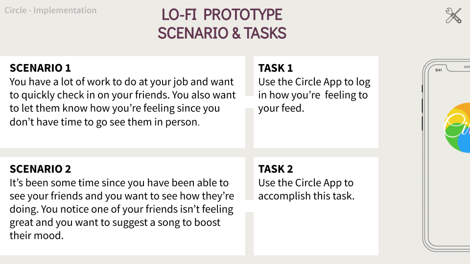
For Lo-Fi Prototypes we have had to come up with 2 scenarios for 2 functions that we wanted to test users on to see if they understand how to use the app
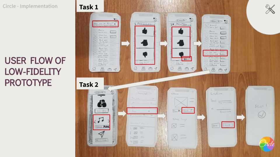
1. The user is shown their home feed page and will click the “How are you feeling?” drop down to log in their feelings.
2. For physical state, they can select how they feel.
3. They can do the same for their mental state and click “OK”
4. This progress of their physical and mental health will be logged over time through the Apple Health integration.
5. Returning back to the home feed page, the user can check in on friends that are not doing too well.
6. When clicking on “Support” next to their friend’s name, the user has options on how to make their friend feel better.
7. The user can select to send music to their friend and will be prompted to select a song integrated through Apple Music.
8. Once a song is chosen by the user, they can confirm what and who they’re sending to.
9. The user receives a confirmation page that the song was sent.
User should be able to complete these with no problem, right?
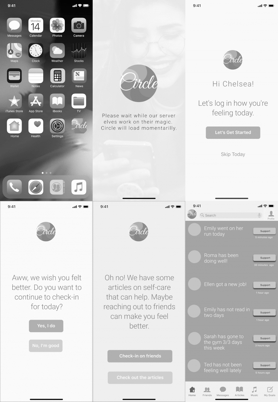
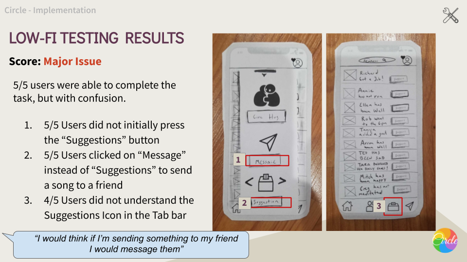
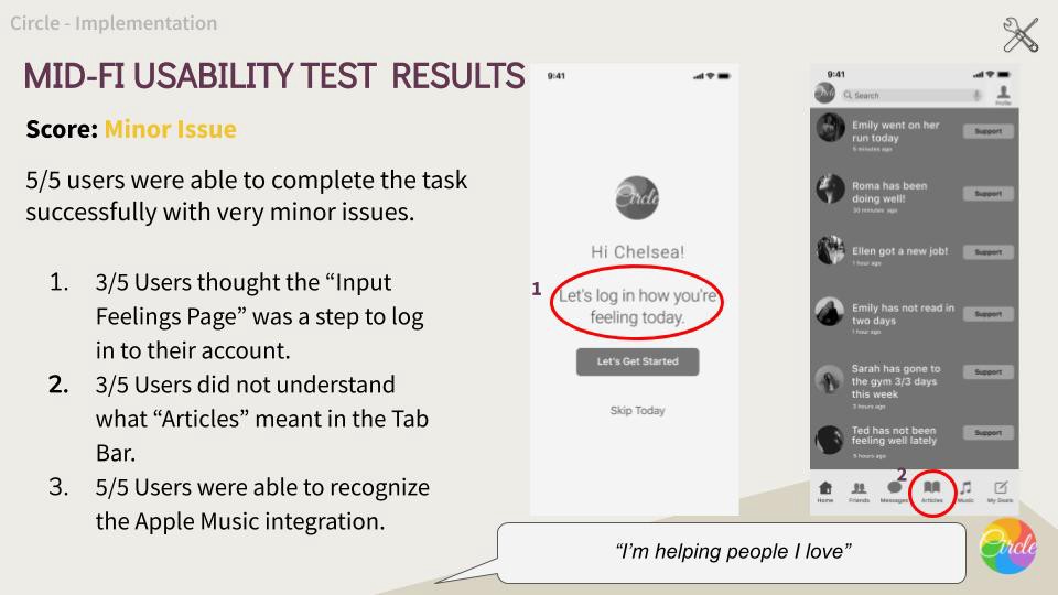
Analysis:
While doing User-Testing we realized that some of the things we are still missing or some things may still be confusing to the users. Here is what we found out.
Recommendations:
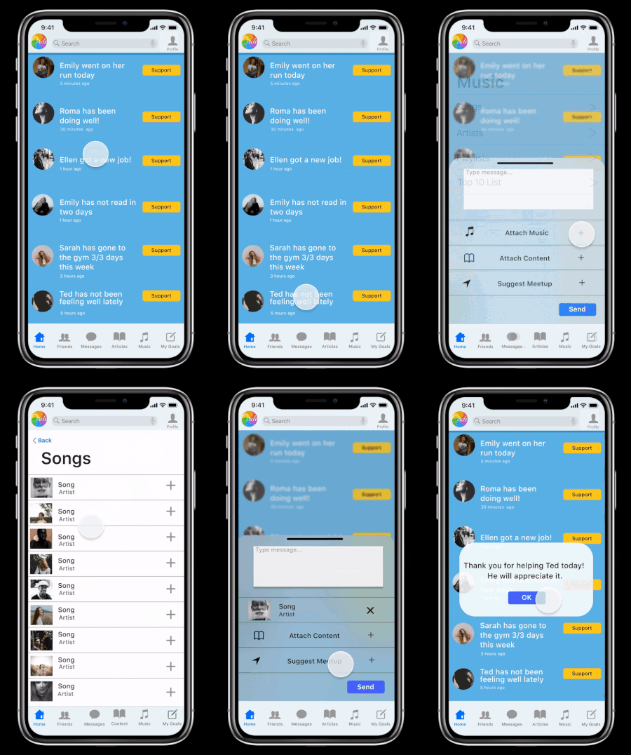
After compiling the results from our Mid-Fi usability tests, we revised the design and created a Hi-Fi prototype in Figma. Let’s see how one of the paths Chelsea can take works.
What happened after?
My team had to do a presentation to internal stakeholders , without any user testing yet done on hi-fi prototypes or any report on that.
We did create a Spec Doc for the app to be handed over to Development Team, so they can at least look over what they need to do in very near future. We will provide them with updated one once the app is approved for the buildout by the stakeholders.
Next Steps
- User Testing on hi-fi prototype
- Hi-Fi User Testing Report
- Implementing feedback into updated design
- Do more User Testing till app is ready to be sent to the Developers.
Learnings
This was our first app development cycle from scratch all the way to the hi-fi prototypes. We had to come up with an idea and make sure this idea will work and easy understandable by users. Taking an idea of how a user views self-care and what do they do to implement it, became our app Circle.

