UX Case Study:

LineUp App: gamification of going out

Brief

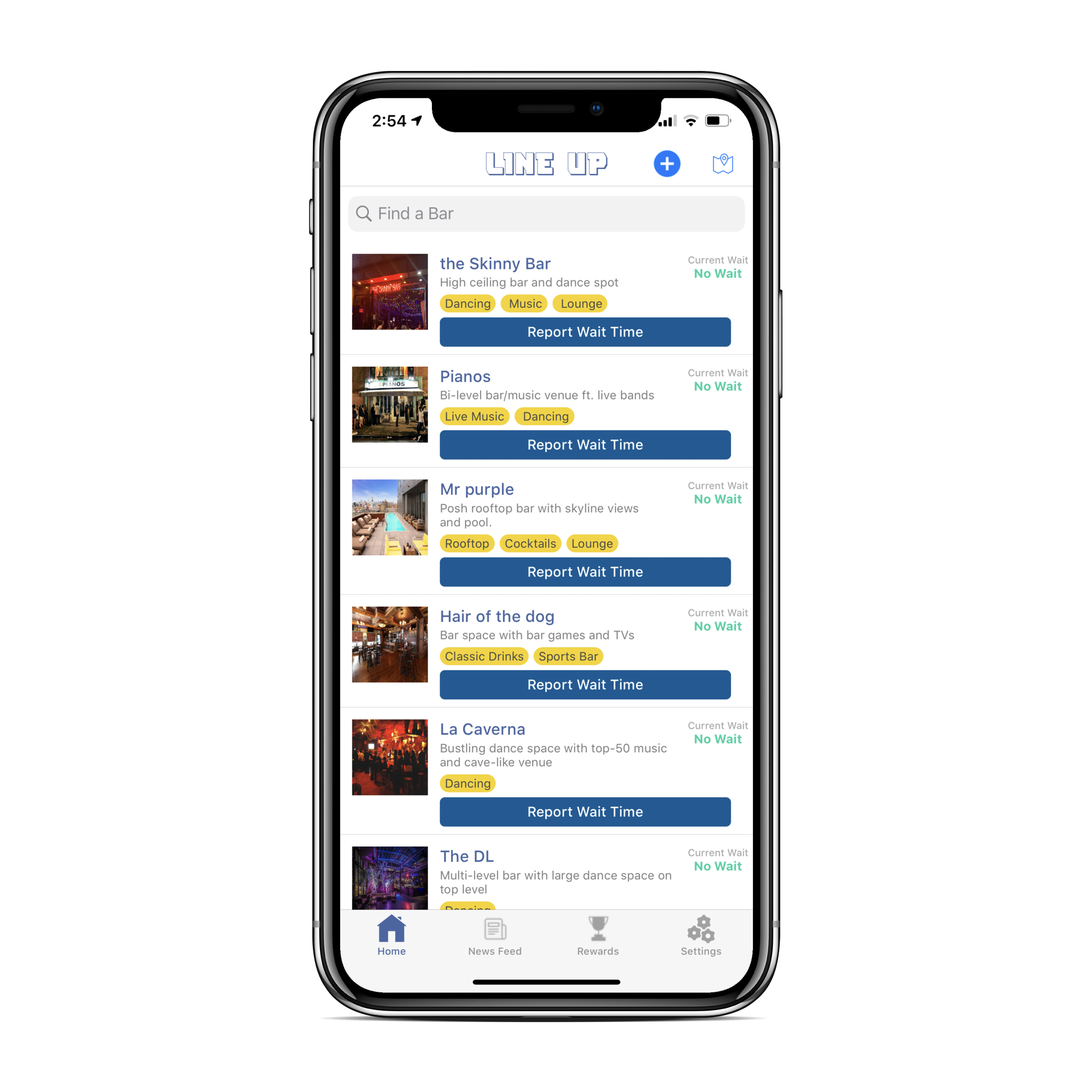
My team was presented with a task to better understand a psyche of LineUp user, test out potential solutions and re-design an interface that will make it easy and fun to report information that other users rely on.

Methods Used

Heuristic Evaluation
Screener Survey
User Interviews (2 sets)
Affinity Mapping (2 sets)
“I” Statements
Persona Development
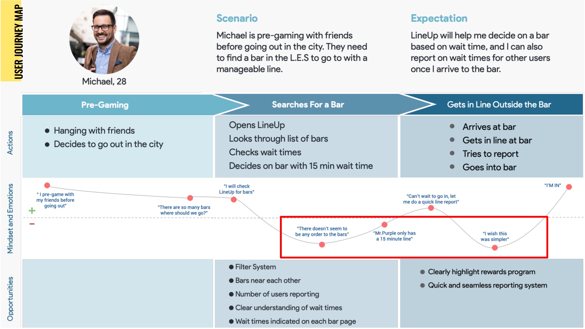
Journey Mapping
Design Studio
MoSCoW Map
Sketching
Wireframes
Rapid Prototyping
Usability Testing
ADA Compliance

Team

Sergey Bestuzhev
Ash Burke
Christiaan Montgomery

My Role

UX Design
UI Design
Presentation Design

Tools Used

Figma
Simpli (similar to Zeplin)
Photoshop CC
Google Slides
Quicktime

RESEARCH & SYNTHESIS

At the beginning of the project my team did a short internal Heuristic Evaluation of the the app to see where are the problem areas can be in the current version of the app. With that in mind, we have decided that we need to interview current LineUp users. While preparing a User Interview Script, we realized that we need to also interview users who have never seen the app before. Through some internal discussions, we came to conclusion that we should interview people who have used apps or sites that are crowdsourced, and never show them the LineUp. We created a Screener Survey for users of the crowdsourcing sites, as well as sent out emails (provided by the client) to users who agreed to participate in the User Interviews about the current version of the LineUp app.
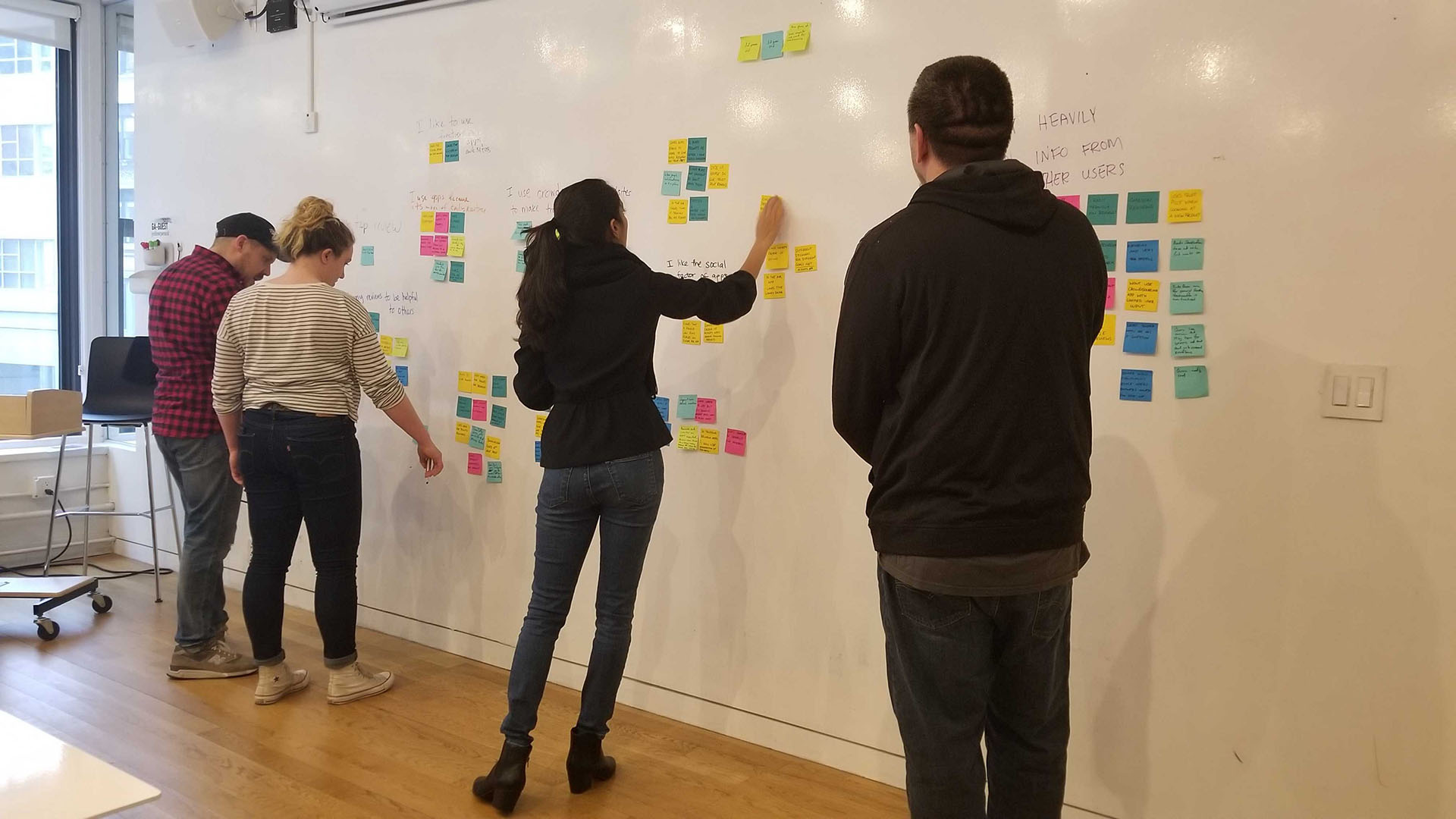
After we interviewed all of the users in both groups, we have invited Founder/CEO of the LineUp app to participate in the Affinity Mapping exercise. She was a fast learner of the process and after explaining what are we doing, she jumped head first to help to come up with final “I” Statements that have been used for the creation of the Persona. Using “I” Statements, me and my team started to work on the Persona that combined the traits of both Crowdsourcing User and Current User of the LineUp app.
Meet Michael who is a young professional and goes out to bars and clubs in the city. He would like have a reliable crowdsourcing app that can provide him with information on where to go and how long the lines might be at the popular venues. His Pain Points are that he has no incentive to engage with the crowdsourcing app and on the current LineUp app doesn’t fully get how the time reporting works (this data came from User Interviews with current users, who were confused how exactly the wait time is calculated). Because he uses other crowdsourcing apps and sites, he uses rewards that allows him to save money. With that in mind, we have worked on creating a User Journey for Michael on his evening out.
Journey Map
Problem Statement

People who want to go to bars in the city use crowdsourcing apps to help them find information on where to go and how long the lines are.

Michael uses the LineUp app to find bars and their wait times, but he is unclear about the wait time reporting system and has a lack of incentive to engage with it.

How might we encourage him to report on LineUp and give him clarity on wait time reporting, while helping him to achieve his goal?

Design
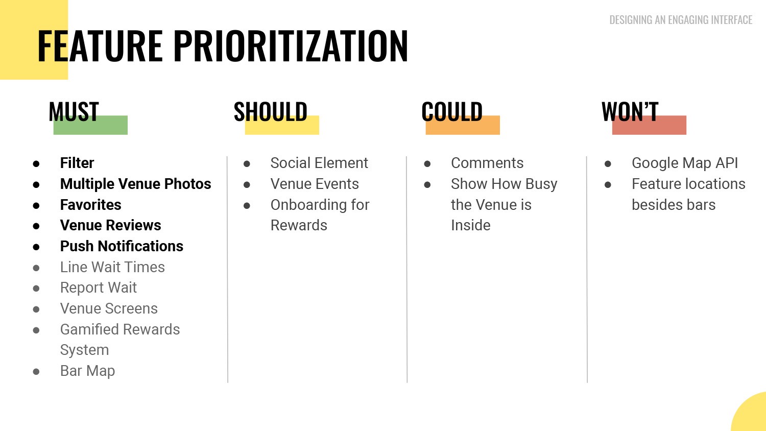
1) With everything we gathered and created so far, we decided that we need to use a MoSCoW Map to prioritize features that we should be working on.
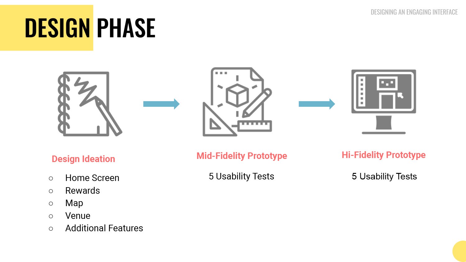
2) From here we moved to the Design Phase that consisted of 3 phases: Design Ideation, Mid-Fidelity Prototype and Hi-Fidelity Prototype
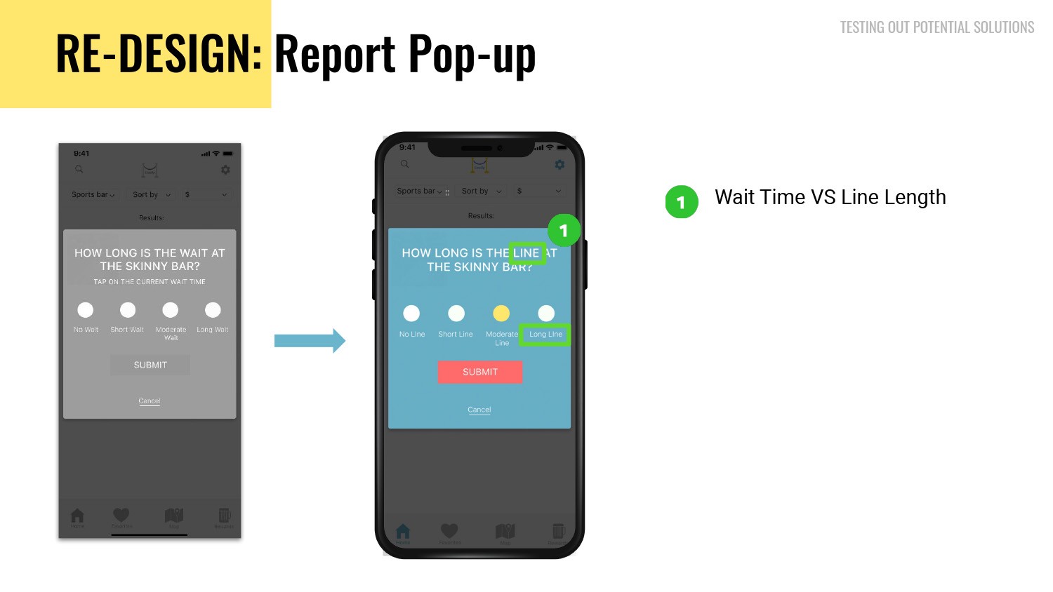
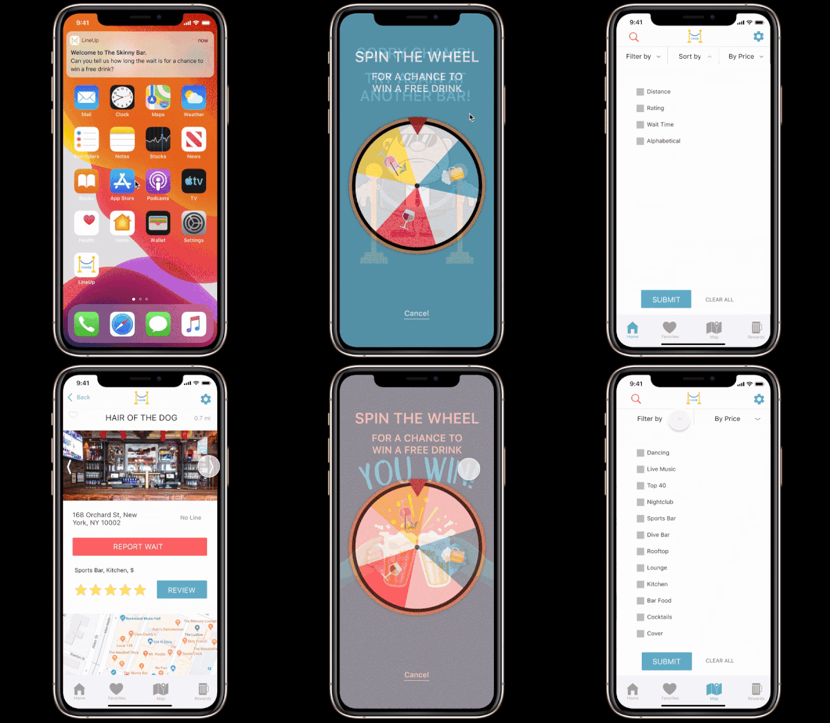
3) With the data collected from Mid-Fi Usability Testing, we applied changes and created Hi-Fi Clickable Prototypes with colors and style guides applied to whole design of the app. During our testing with users, we uncovered that using the words Wait Time was still confusing to users and decided to switch it to concept of Line Length instead across the app.
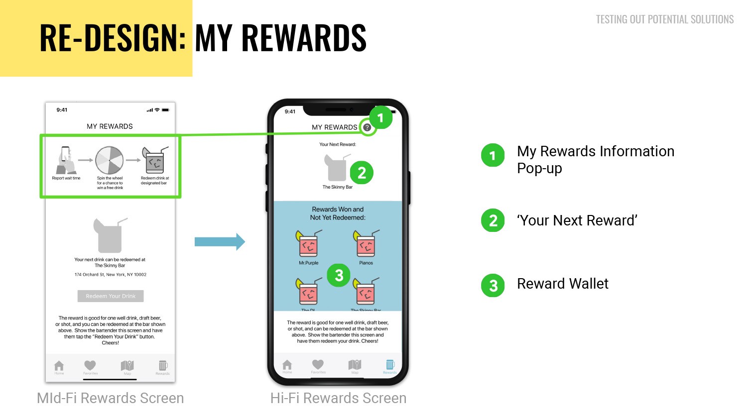
4) The Reward Information is no longer a repetitive image that users see every time when they look at this particular section of the app, but now rather is a popup that should show that information when tapped on the Question Mark Icon. Your Next reward is still grayed out , but takes less of the real estate and does not have information for bar location. We now also have a “Reward Wallet” where users collect their rewards that they can redeem at the bars that participate in the program.
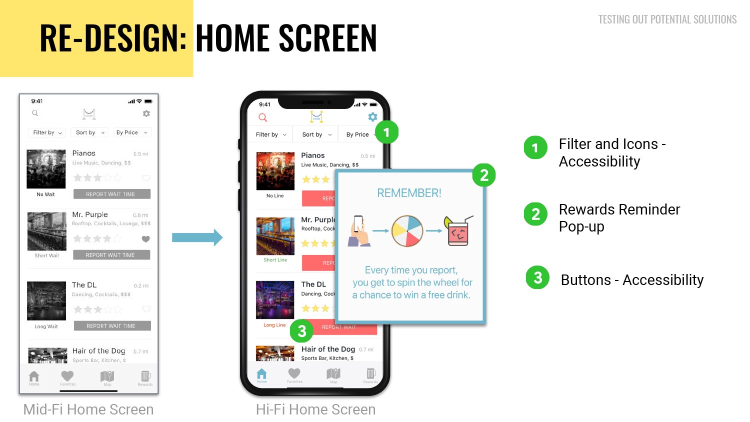
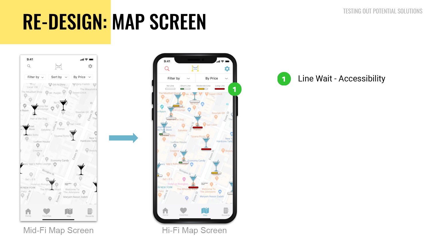
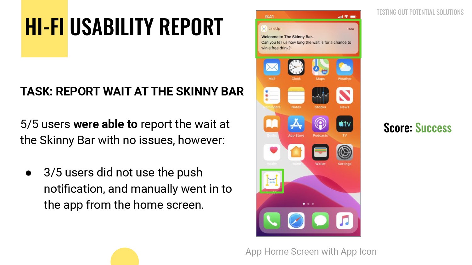
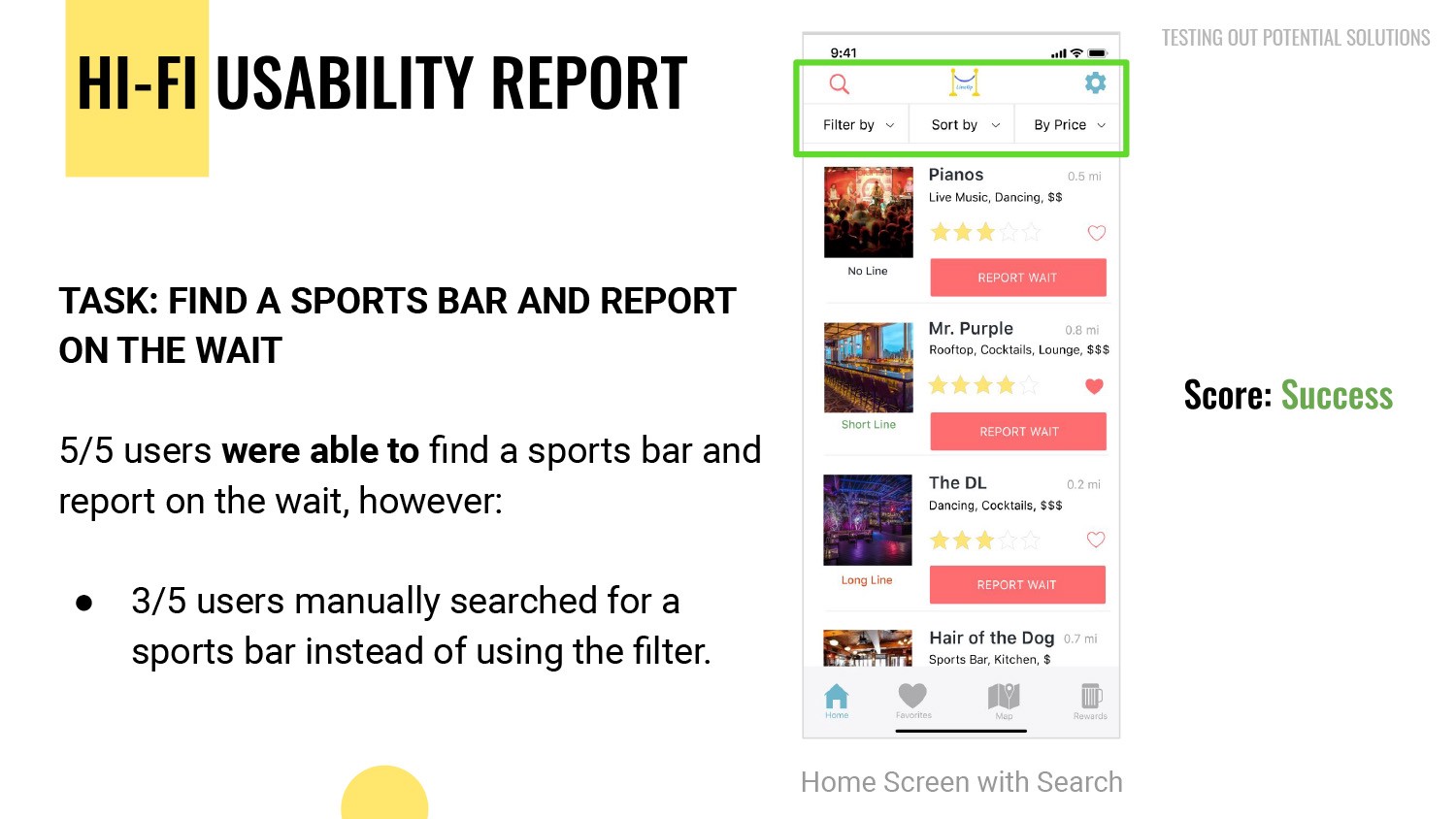
5) For the Home Screen during our Mid-Fi User Testing we realized that buttons are still small and still not visible and not size that should meet Accessibility standards. Both Filter and Icons, as well as Buttons had to be enlarged to meet those said standards in Hi-Fi Prototypes. We have also created a reminder for users to report the Line Length for a chance to get a free drink at any participating venues. On our new Map Screen, we left the martini glass icon idea, but now we’ve added a line (Status Meter) under a martini glass that indicates the Length of the line, from No Line all the way to the Long Line.

Virtual Walkthrough of the new LineUp app

User using the app to report information about Line Length.

final delivery

On Dec 13 2019, we have presented our report to the client of LineUp app. After the presentation to the client we’ve have submitted the Final Deliverables to the client that included: Final Mock-up with Functional Annotations that included the Style Guide, Feature Prioritization Map, “I” Statements, User Journey and User Persona/Problem Statement, all Usability Tests results and Final Presentation PDF as well.

Next Steps

Implement Hi-Fi design changes
Usability Testing with Current LineUp Users
Review analytics for user engagement

Learnings

Improving an app is a continuous process. Technology goes ahead every day, as well as how we get/read/process information via outlets that we use on daily or at least occasionally. Working with massive data we collected during this project, we learned to understand how the app works and what can be implemented even in the future version of the app after ours.